

Block sections for Tailwind & React
Production-ready website sections in Tailwind CSS, HTML and React. Copy the code into Cursor, v0 or Claude, or download it.
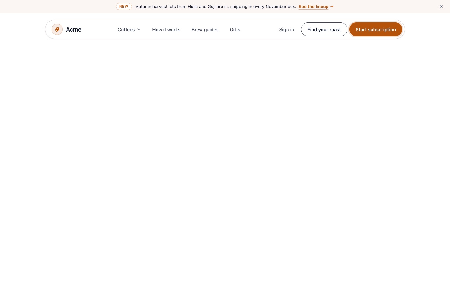
Navbar 03: Floating Pill Navbar with Announcement Bar and Dropdown
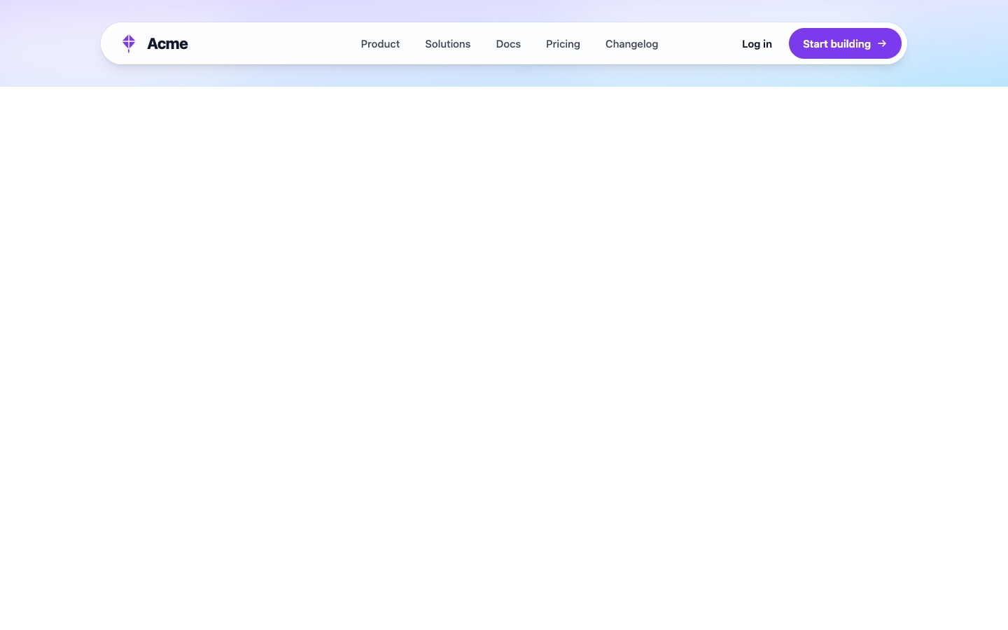
Navbar 01: Rounded Navbar with Centered Links, Login and Mobile Menu Button
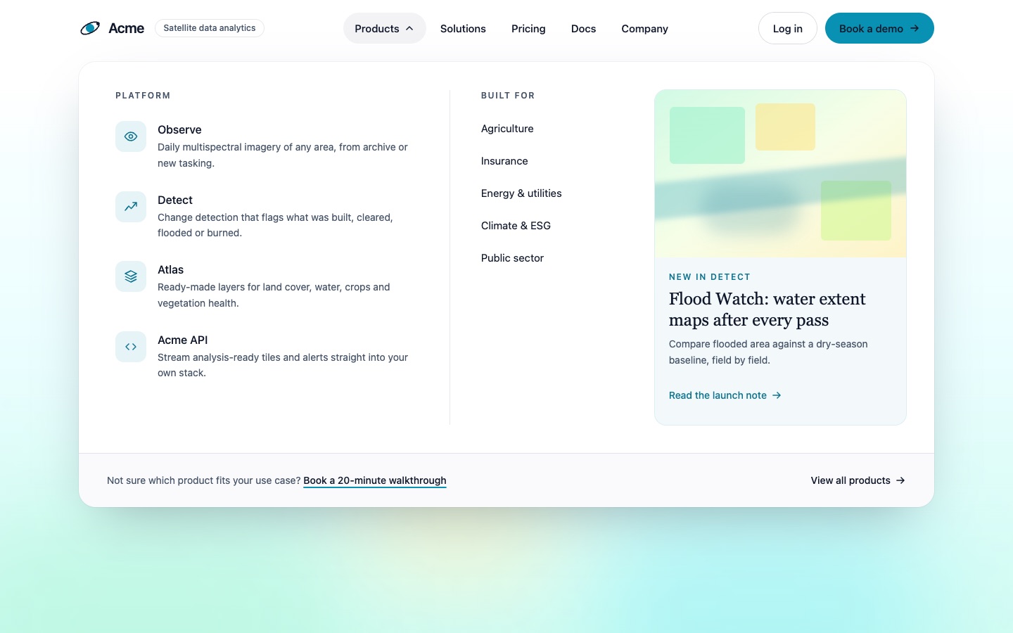
Navbar 02: Navbar with Open Mega Menu, Product Links and Featured Card
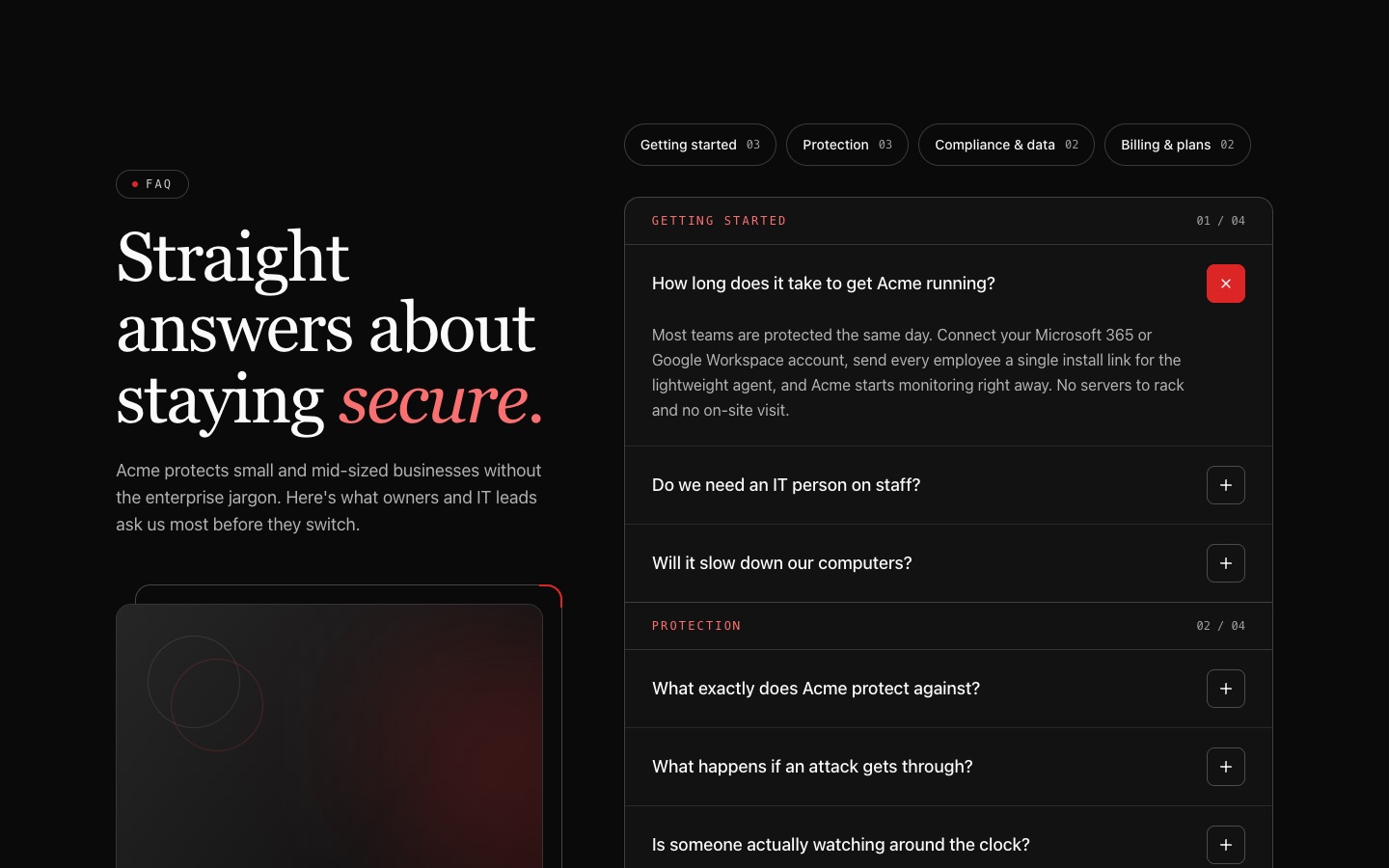
FAQ 04: Dark Categorized FAQ with Category Pills and Accordion
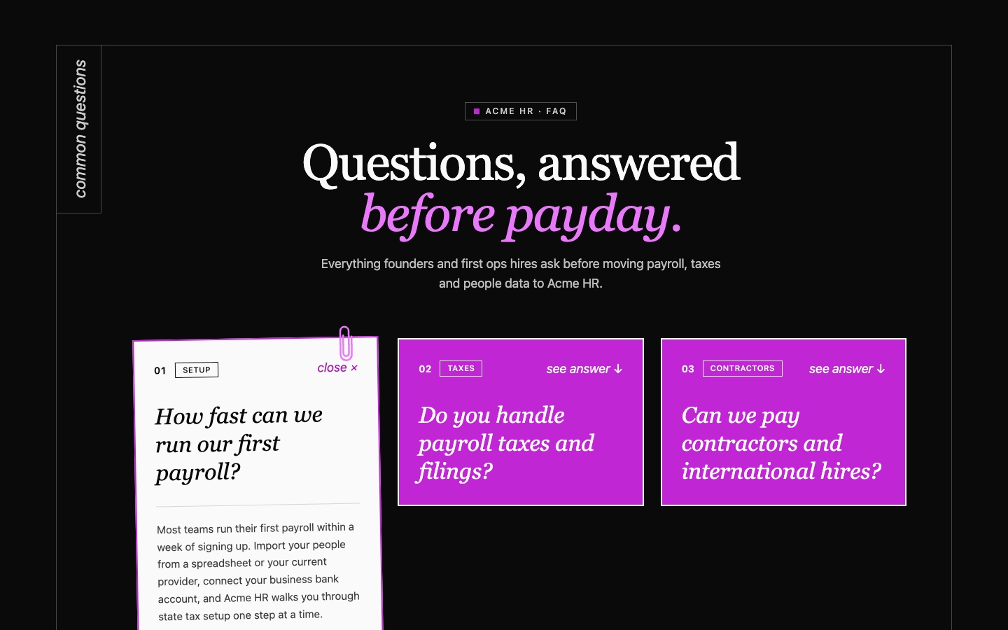
FAQ 02: Dark FAQ Card Grid with Six Expandable Question Tiles
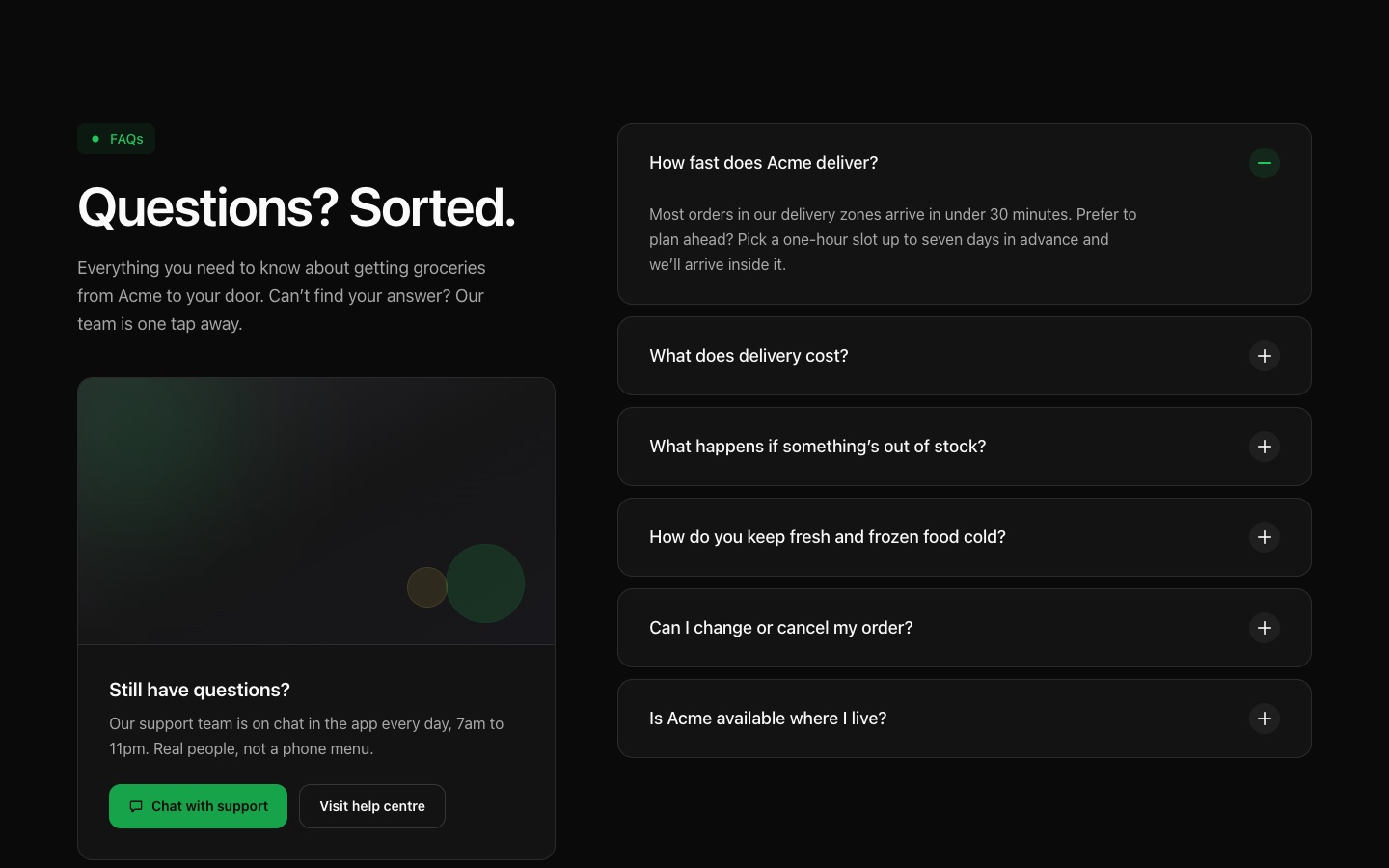
FAQ 05: Dark FAQ Accordion with Still Have Questions Card
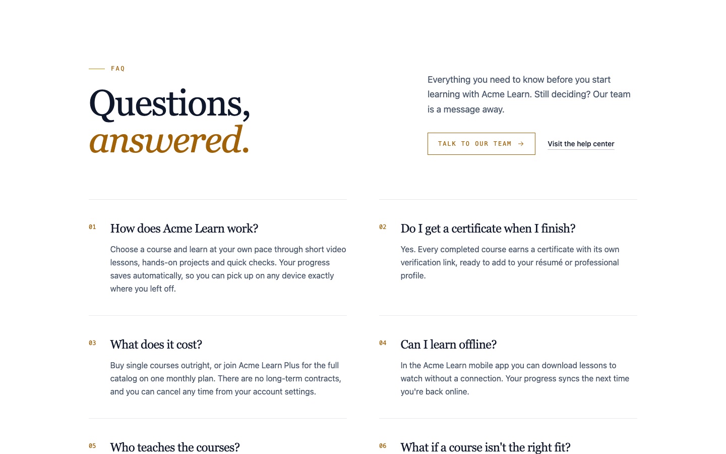
FAQ 03: Two-Column FAQ Grid with Numbered Open Answers
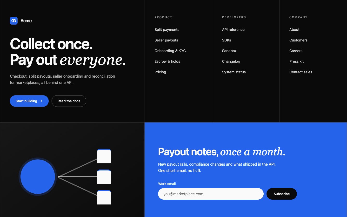
Footer 04: Dark Grid Footer with Newsletter Panel and Oversized Wordmark
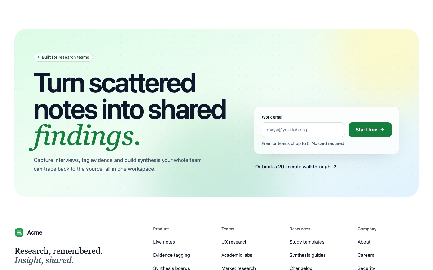
Footer 03: Footer with Gradient Signup Band, Four Link Columns and Faded Wordmark
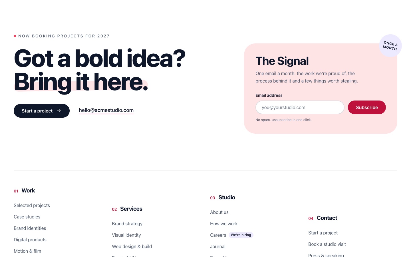
Footer 01: Large Footer with Newsletter Card, Staggered Link Columns and Giant Wordmark
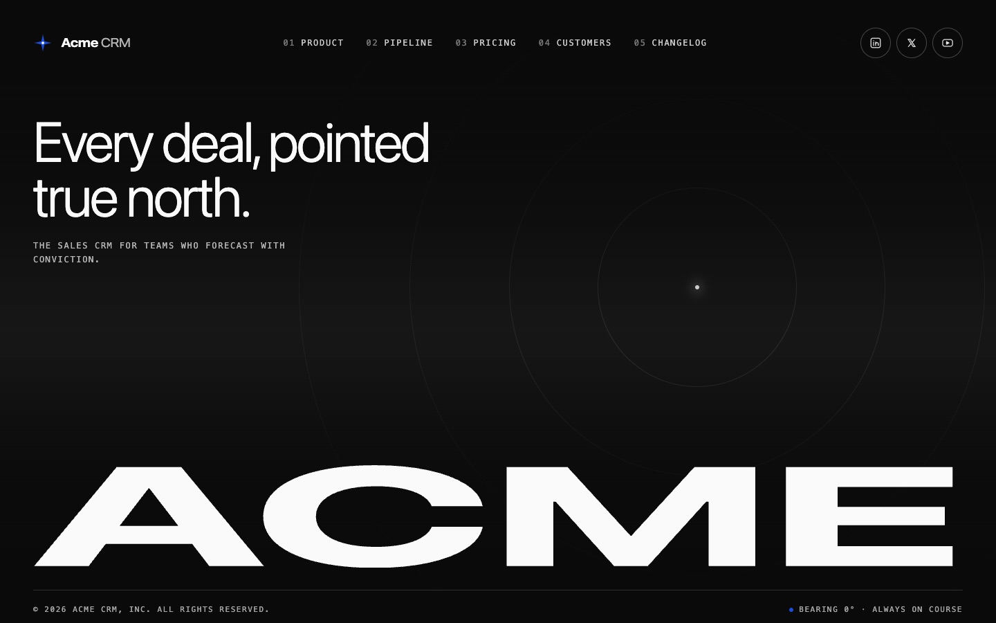
Footer 02: Minimal Dark Footer with Inline Links, Social Icons and Wordmark
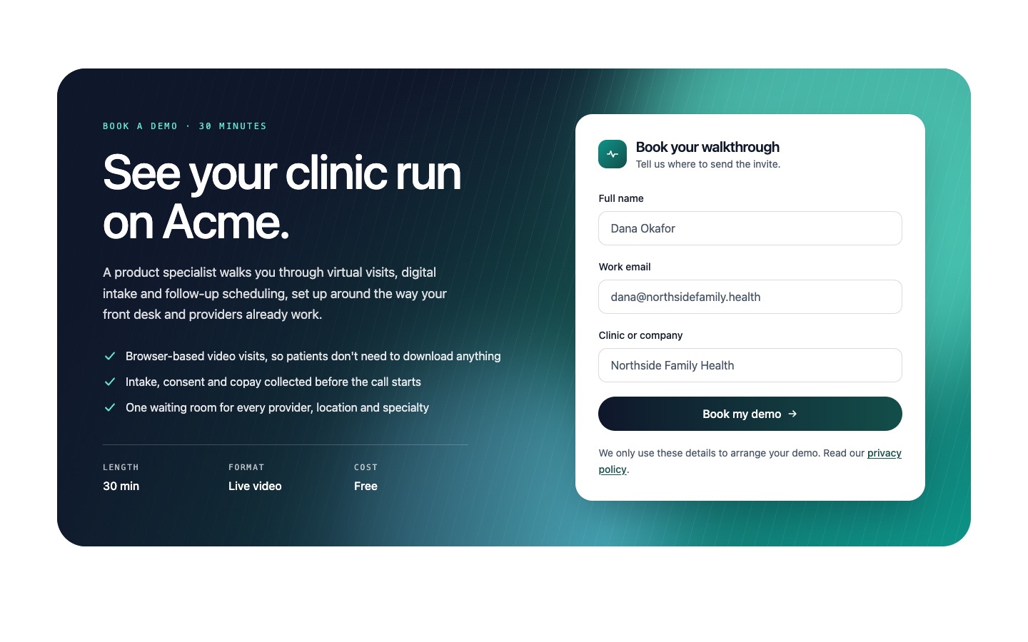
CTA 06: Demo Booking CTA with Form Card on Dark Gradient
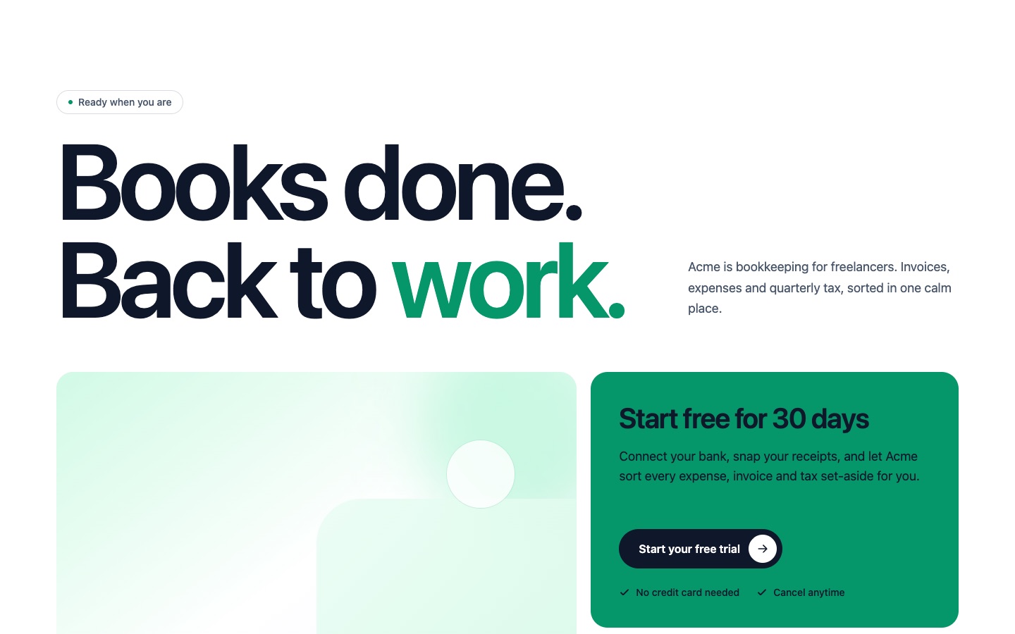
CTA 05: Minimal Light CTA with Oversized Headline, Image Card and Avatar Rating
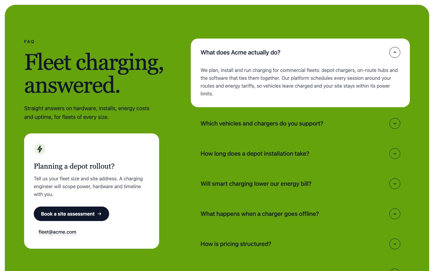
FAQ 01: Two-Column FAQ Accordion with Contact Card on a Color Panel
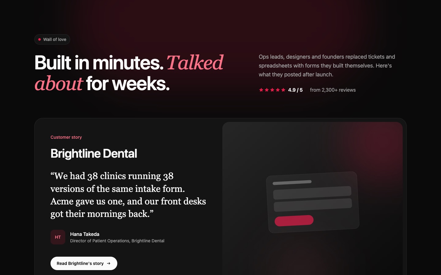
Testimonial 06: Dark Wall of Love with Customer Story and Six Social Post Cards
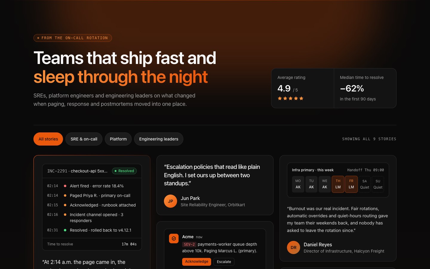
Testimonial 02: Dark Masonry Testimonial Wall with Nine Quote Cards and Rating Stats
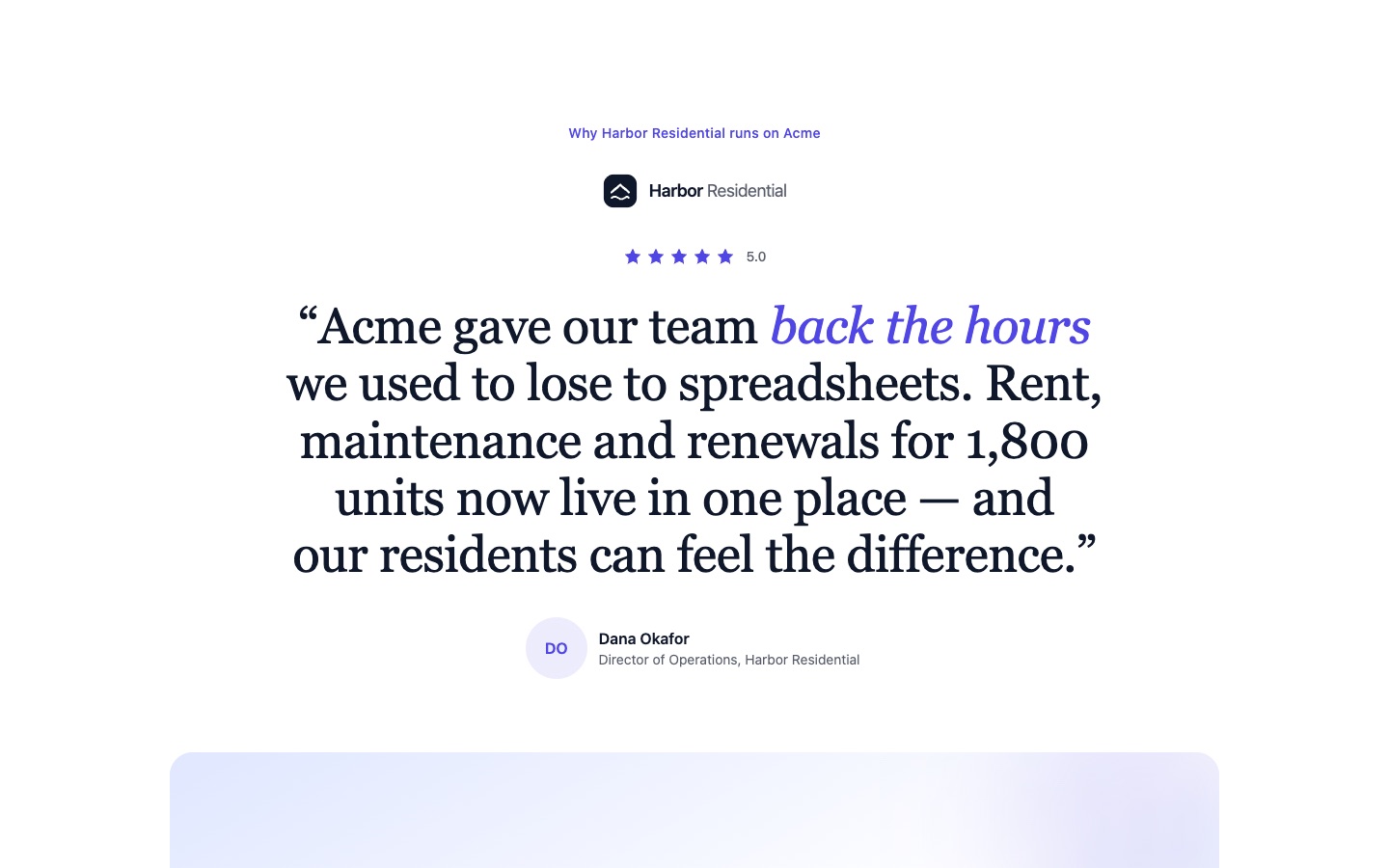
Testimonial 03: Centered Big Quote Testimonial with Star Rating and Results Card
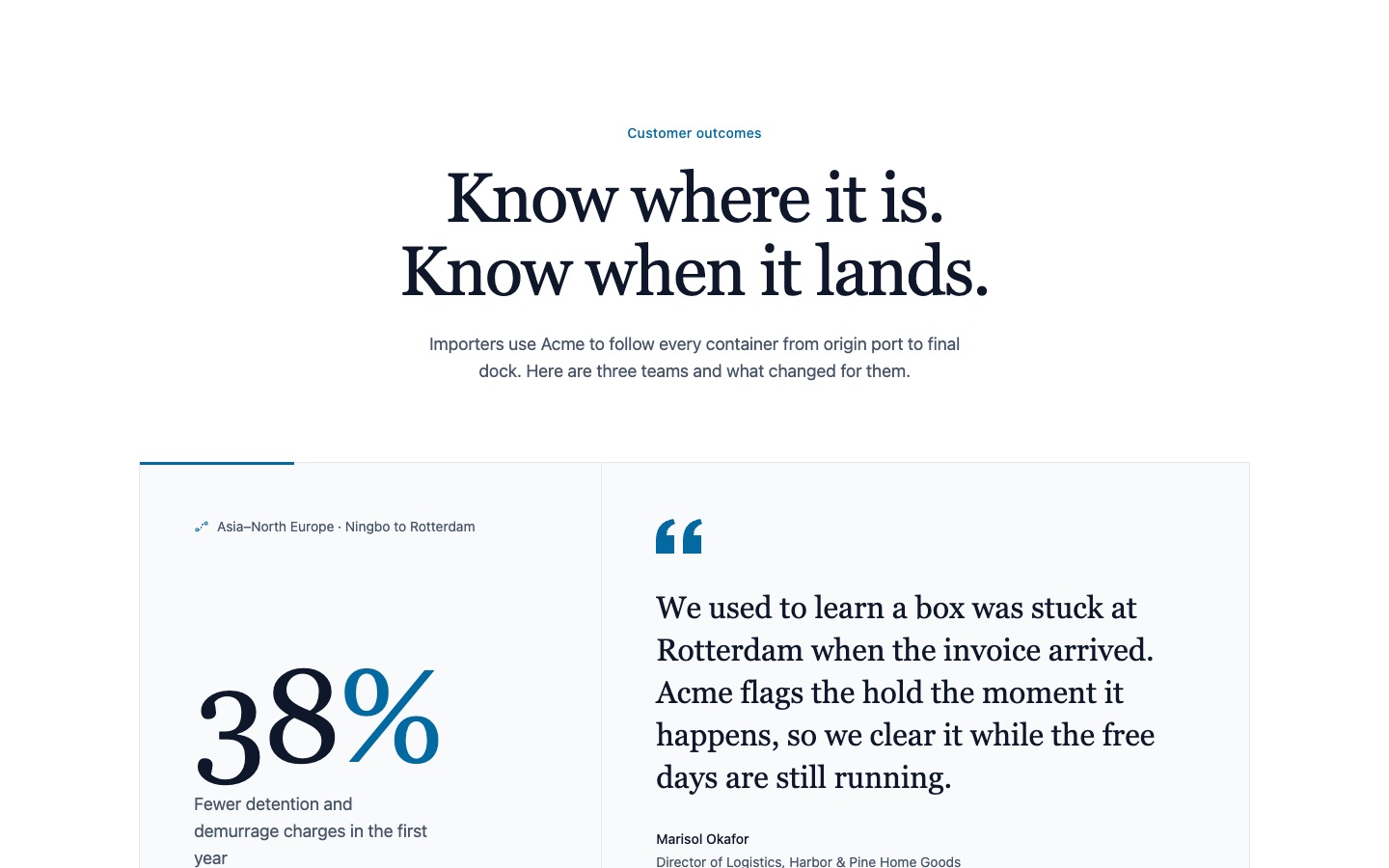
Testimonial 05: Tabbed Testimonial Panel with Big Result Metrics
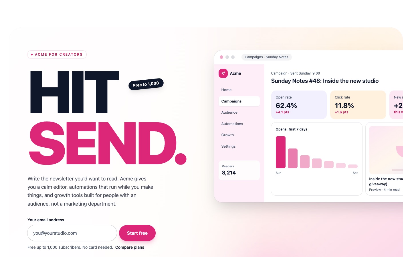
CTA 04: CTA Banner with Peeking App Dashboard Mockup and Email Signup
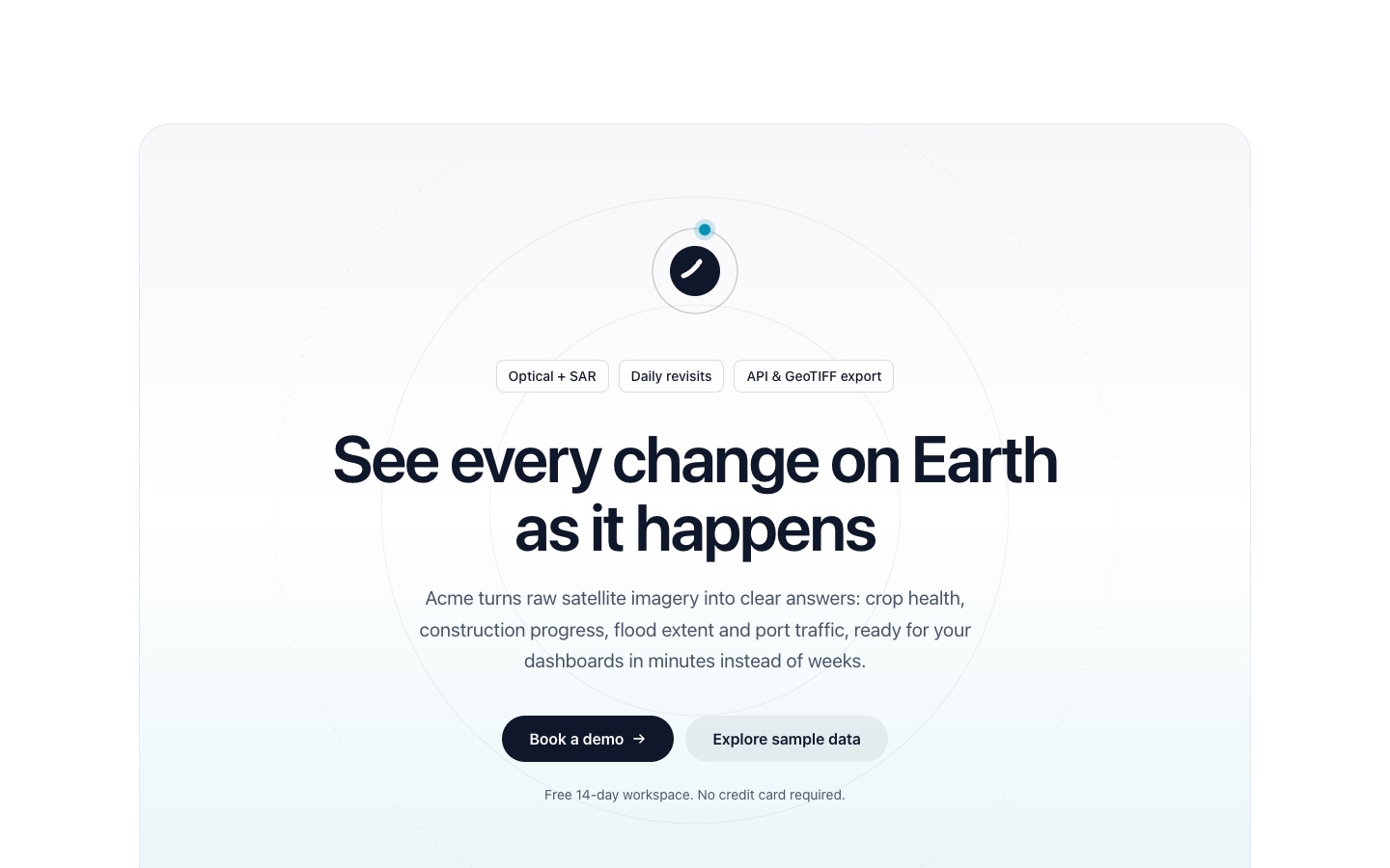
CTA 02: Centered Gradient CTA Card with Highlight Chips and Two Buttons
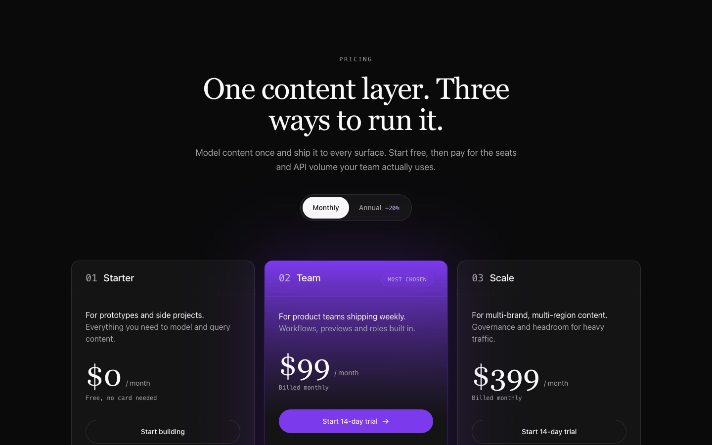
Pricing 07: Dark Three-Plan Pricing with Gradient-Bordered Middle Card
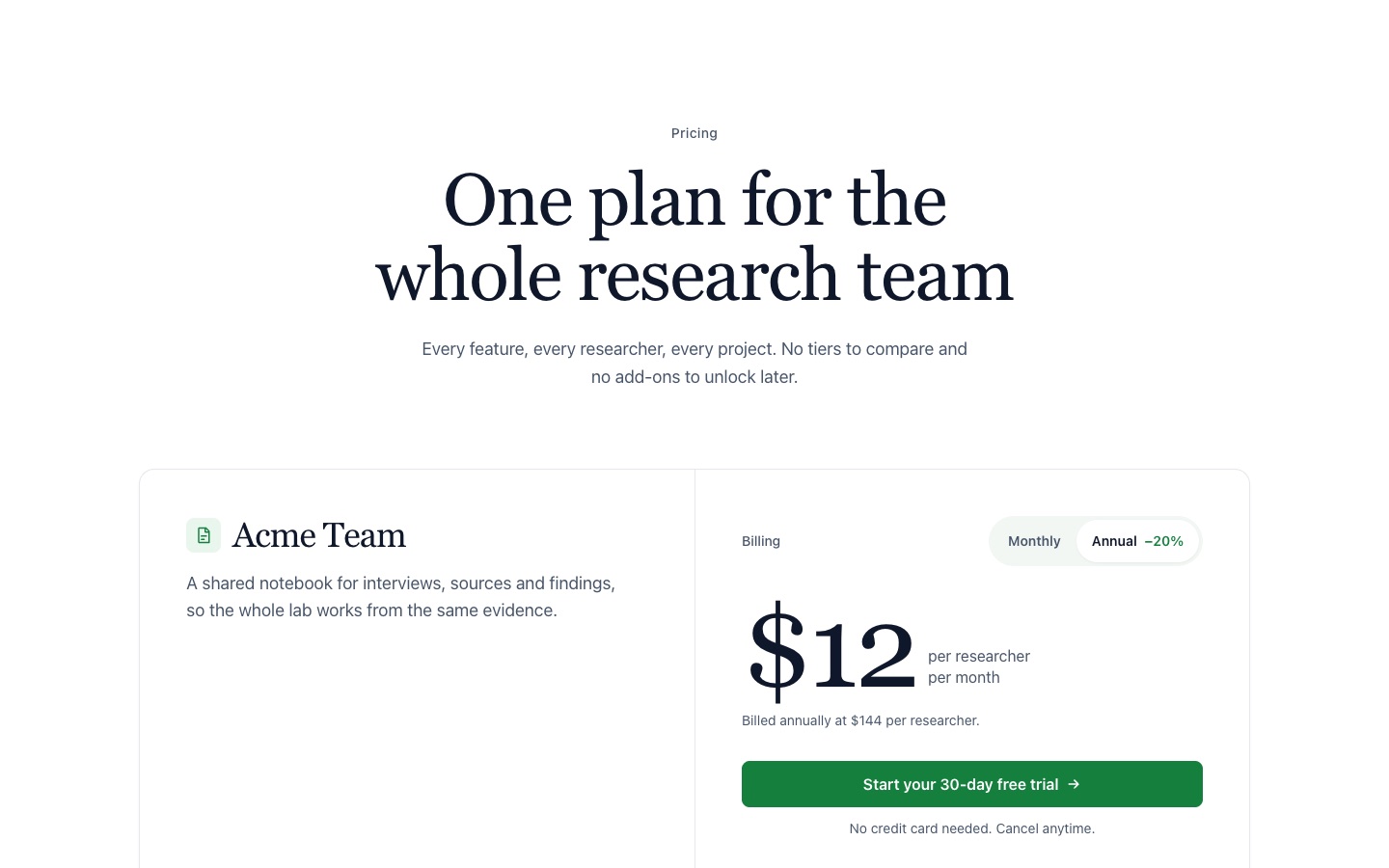
Pricing 05: Single-Plan Pricing with Oversized Price, Feature List and FAQ
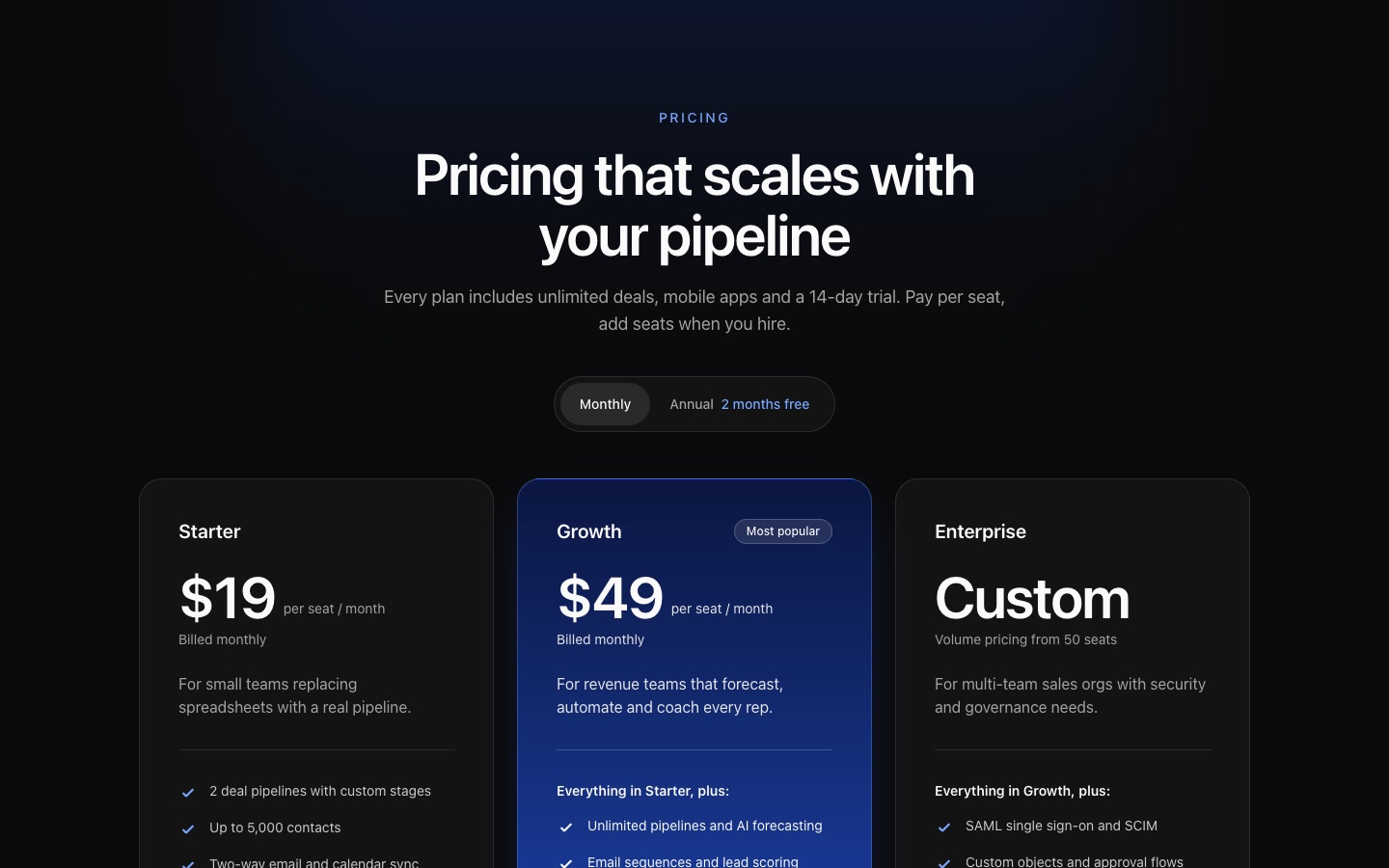
Pricing 04: Dark Three-Plan Pricing with Full Feature Comparison Table
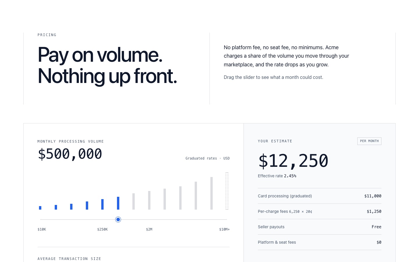
Pricing 06: Usage-Based Pricing Calculator with Volume Slider and Rate Bands
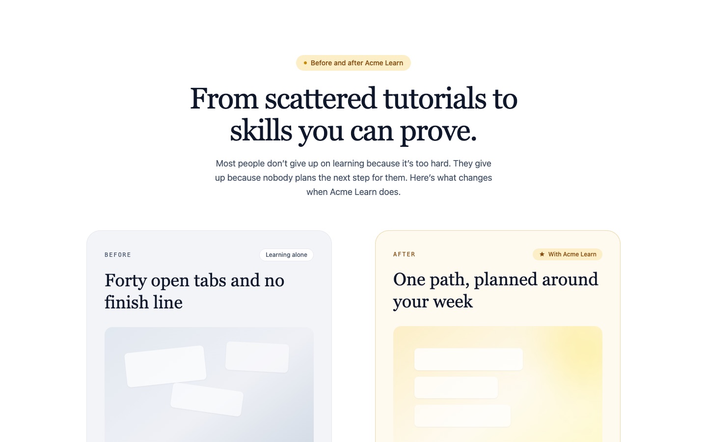
Feature 08: Before and After Comparison Feature Cards
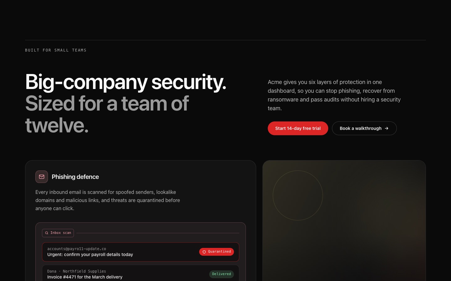
Feature 09: Dark Six-Card Feature Grid with Icons and Mini UI Panels
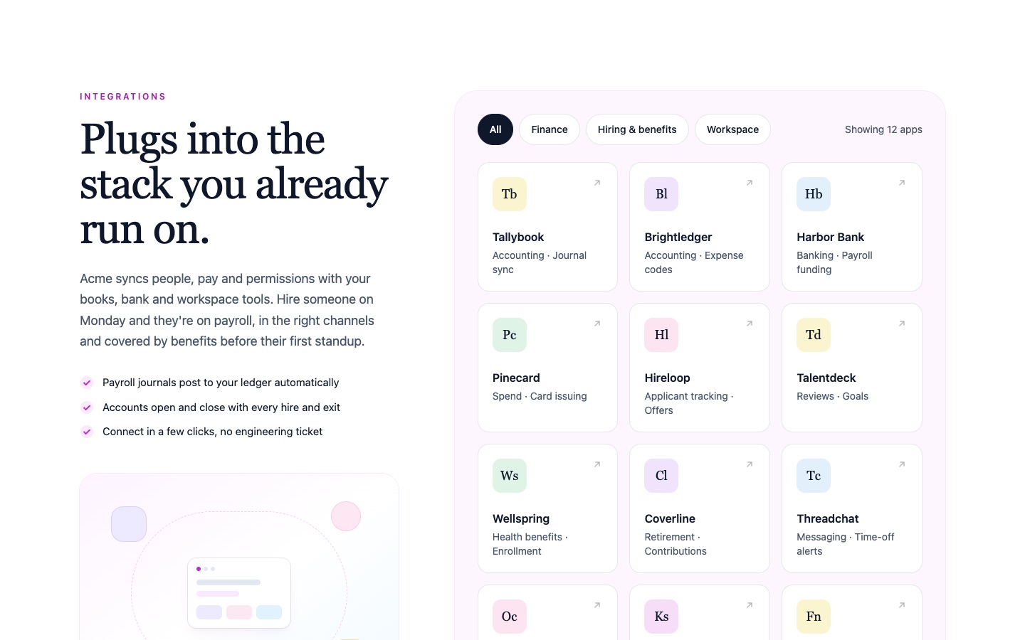
Feature 07: Integration Grid with Filter Pills and Twelve Initials App Tiles
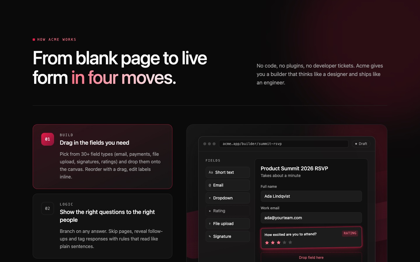
Feature 05: Dark Numbered Feature Steps with Sticky Builder Preview
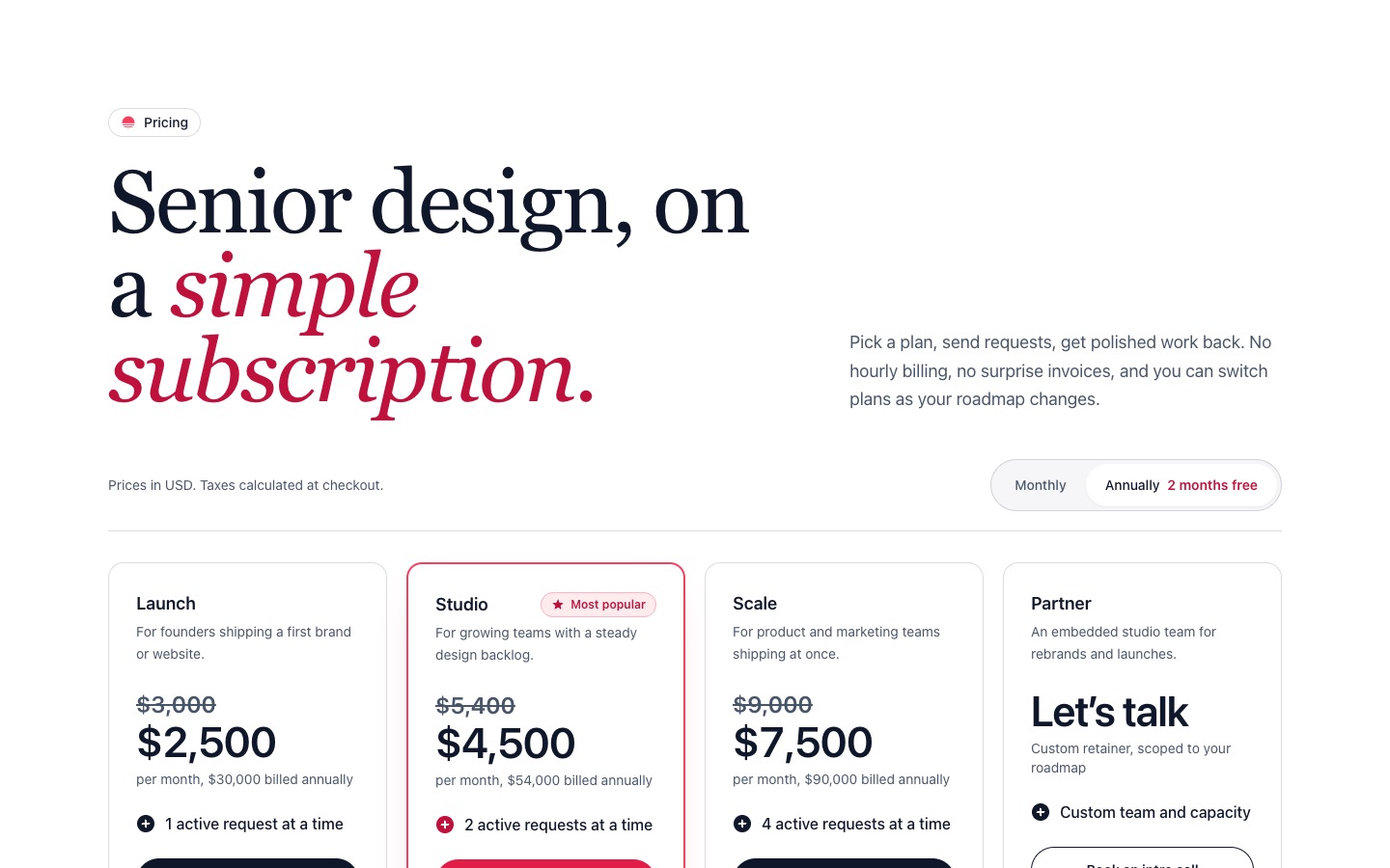
Pricing 03: Four-Tier Pricing Cards with Most Popular Badge and Annual Toggle
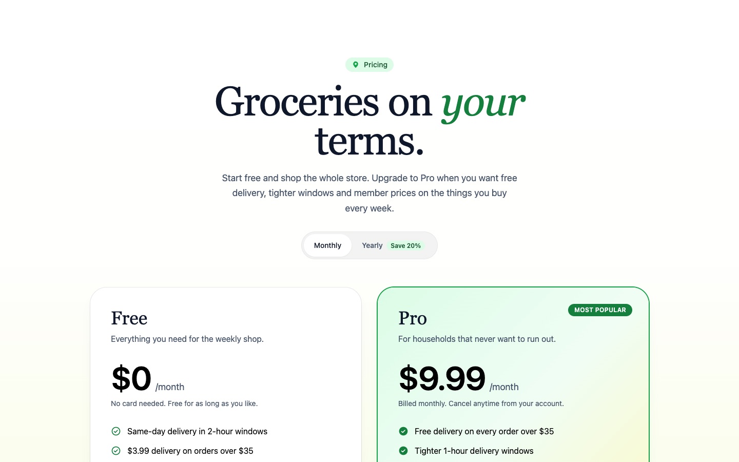
Pricing 02: Two-Plan Pricing with Free and Pro Cards and Comparison Table
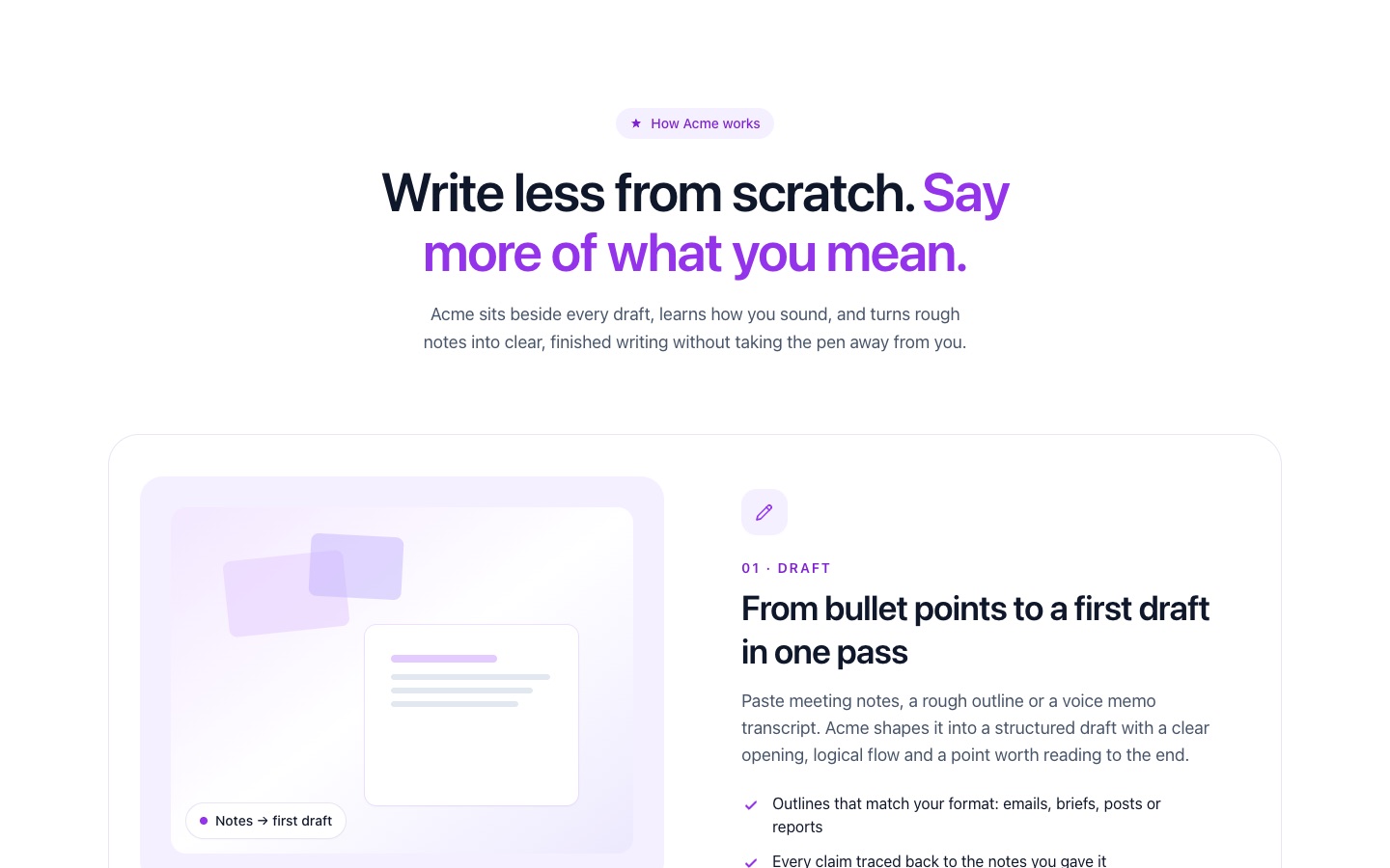
Feature 03: Alternating Zigzag Feature Rows with Image Slots and Checklists
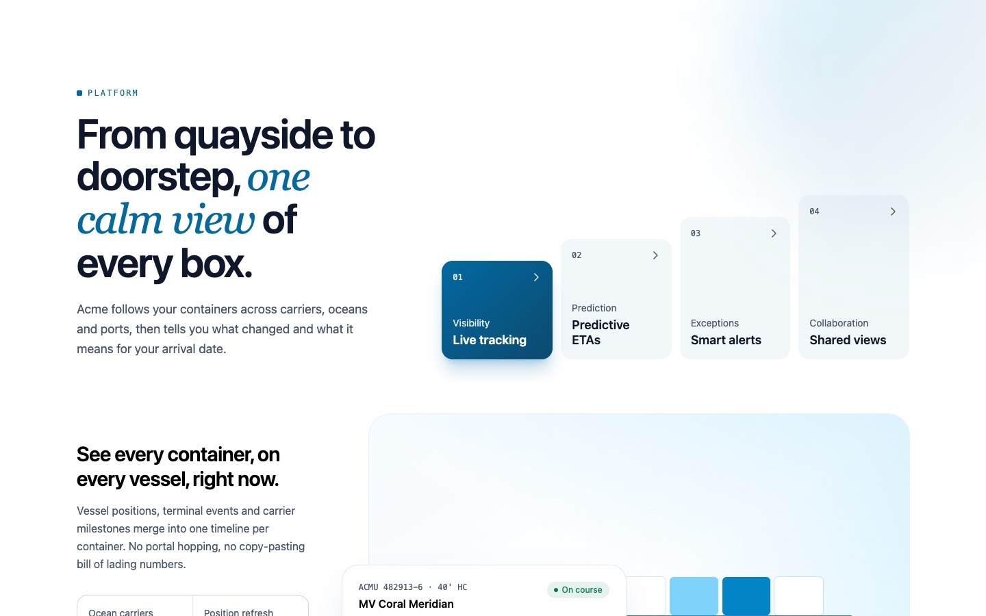
Feature 04: Tabbed Feature Showcase with Stepped Tab Cards and Floating Detail Card
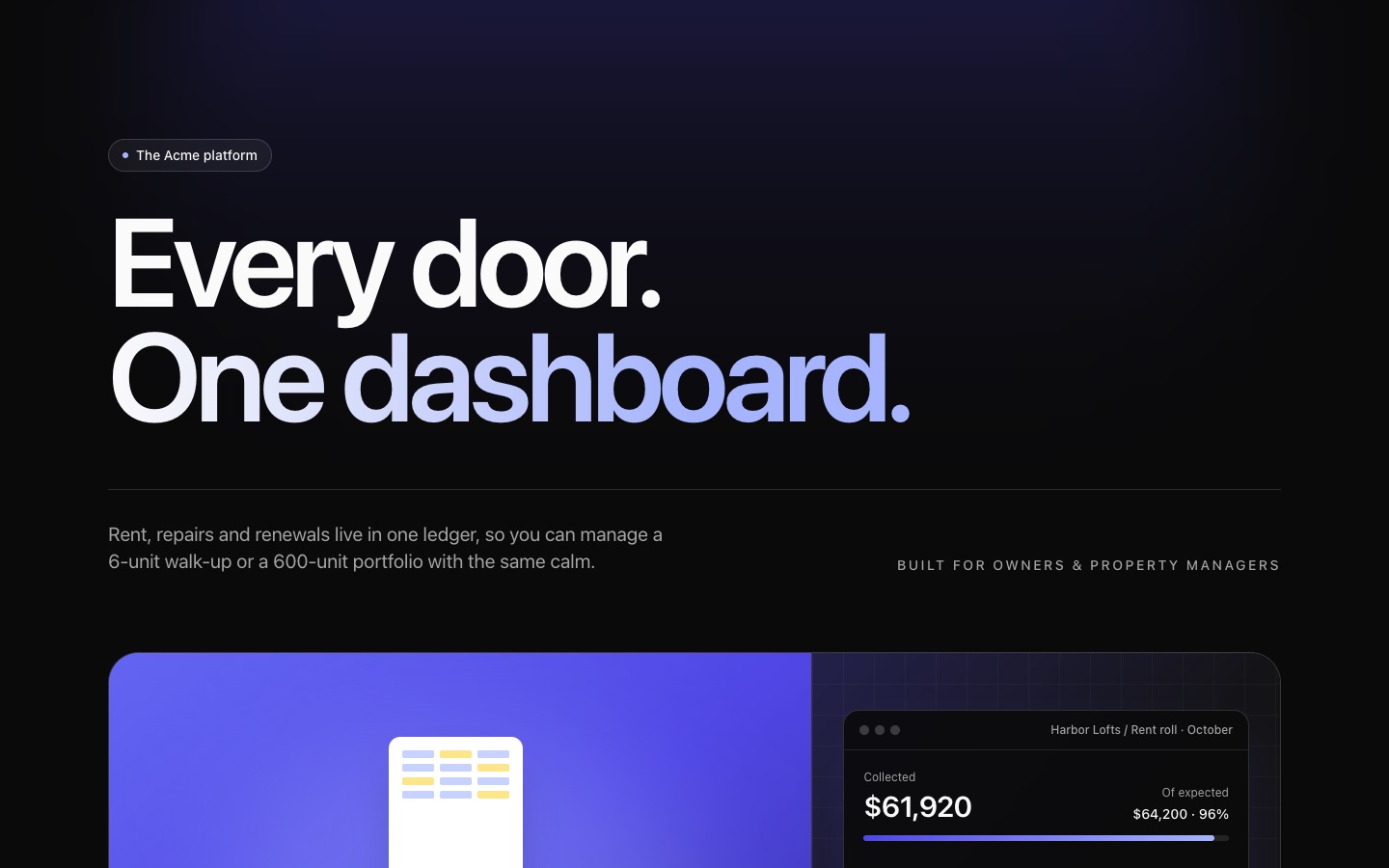
Feature 02: Dark Three-Column Feature Grid with Icons and Dashboard Preview
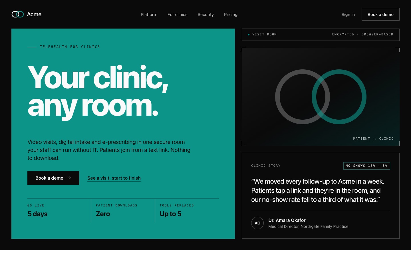
Hero 09: Bold Color-Block Hero with Testimonial Card
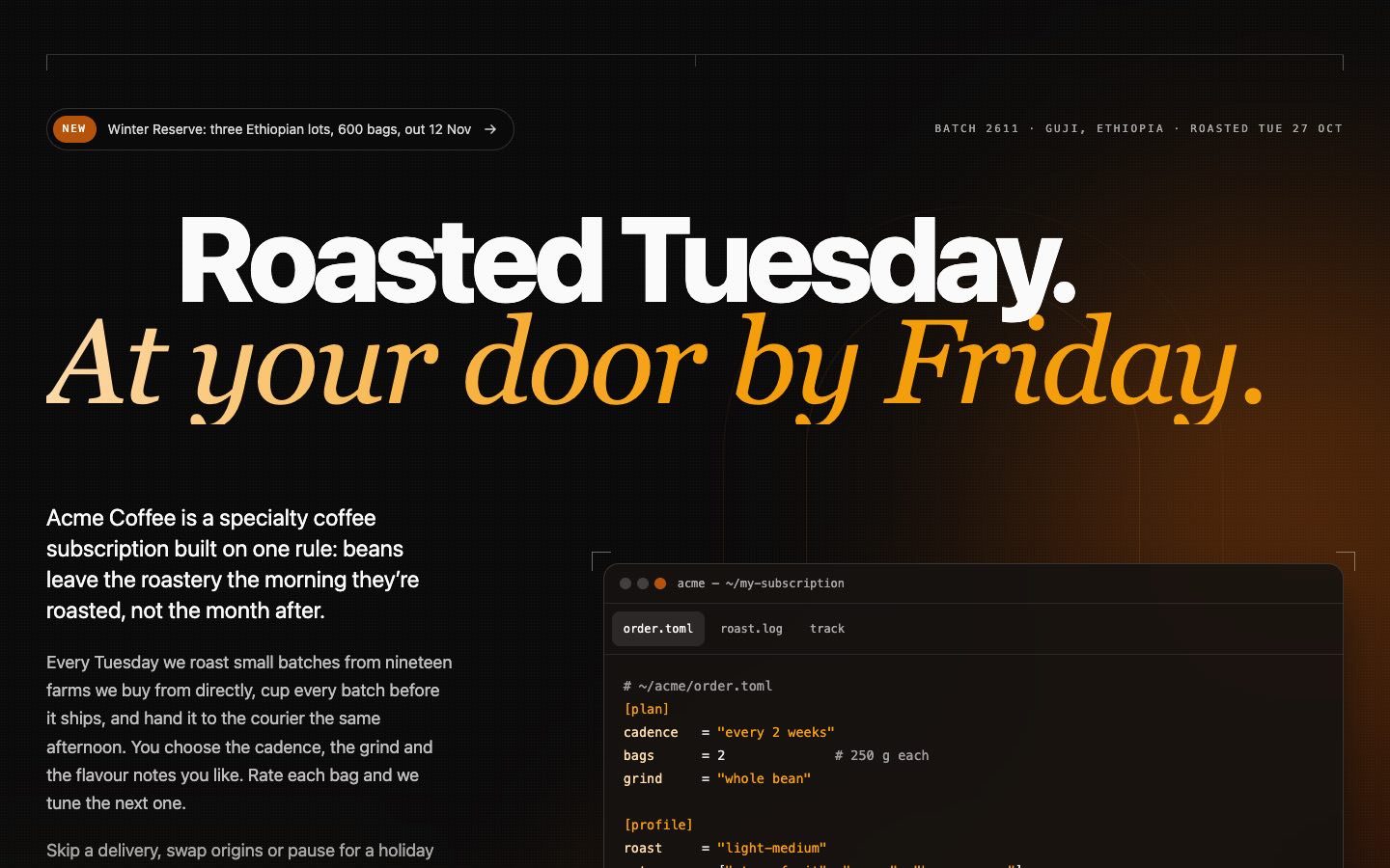
Hero 06: Dark Gradient Glow Hero with Terminal Window Mockup
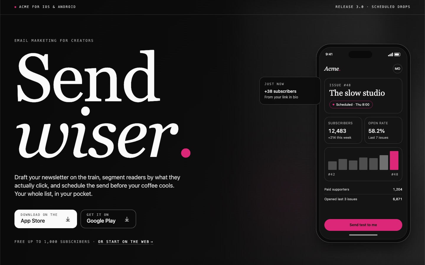
Hero 07: Dark Mobile App Hero with Store Buttons and Phone Mockup
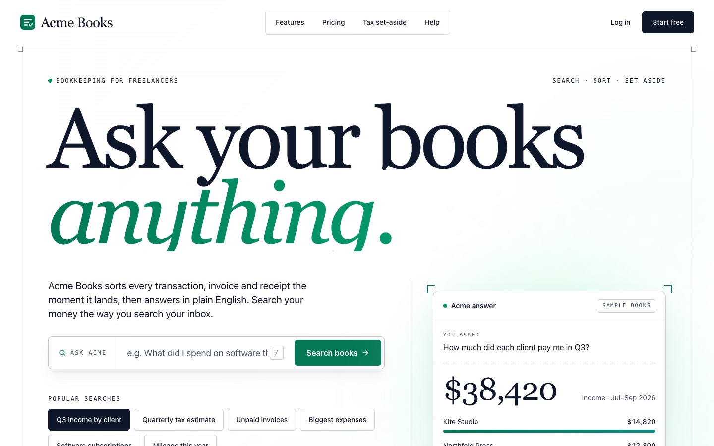
Hero 08: Search-First Hero with Popular Searches and Answer Card
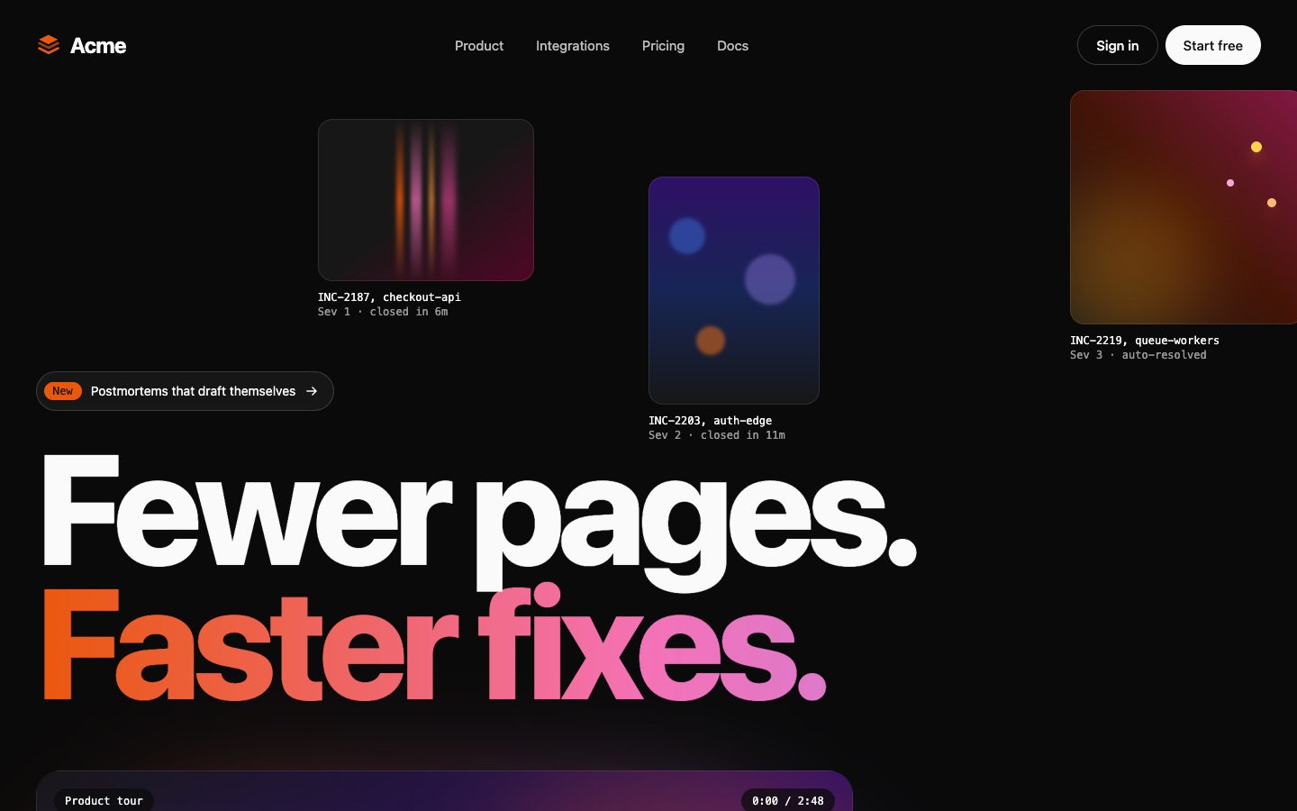
Hero 10: Dark Hero with Video Tour Card, Play Button and Chapters
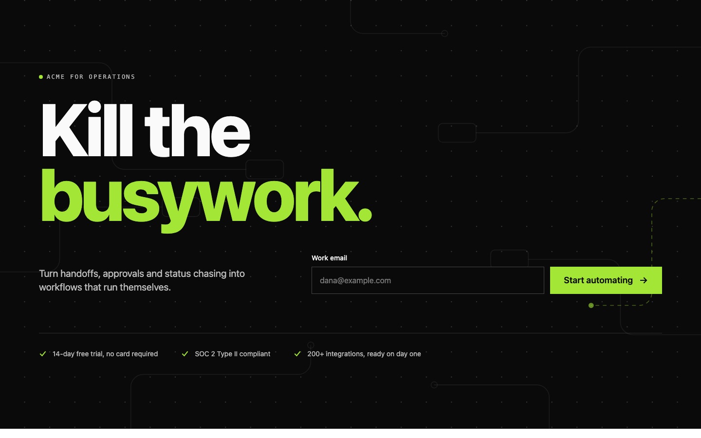
CTA 01: Dark CTA with Oversized Headline and Email Signup
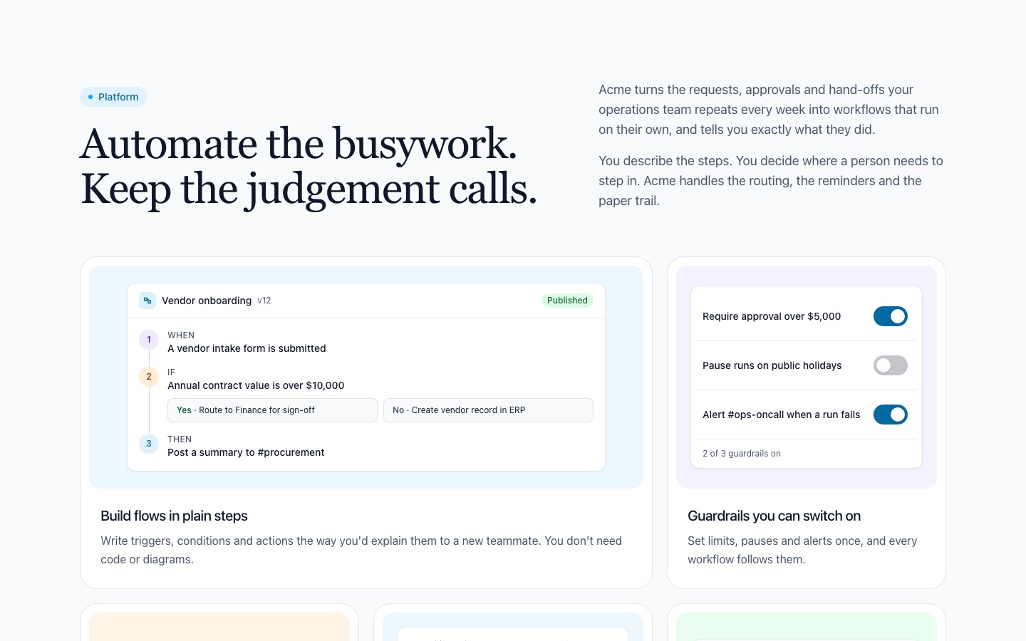
Feature 01: Feature Bento Grid with UI Cards
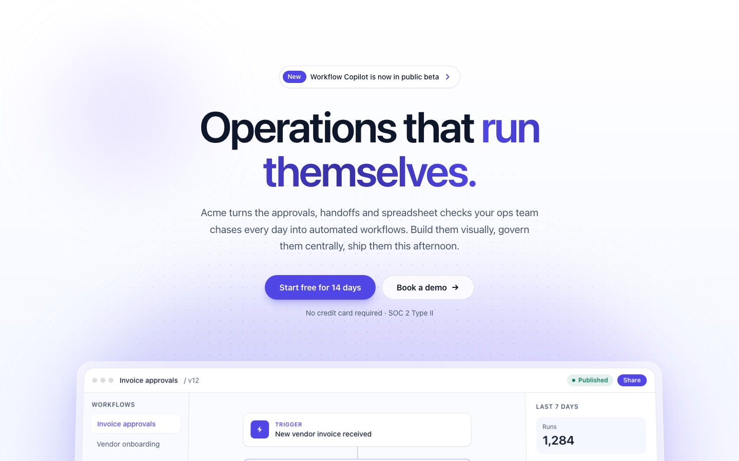
Hero 01: Centered Gradient Hero with Product Mockup and Logo Strip
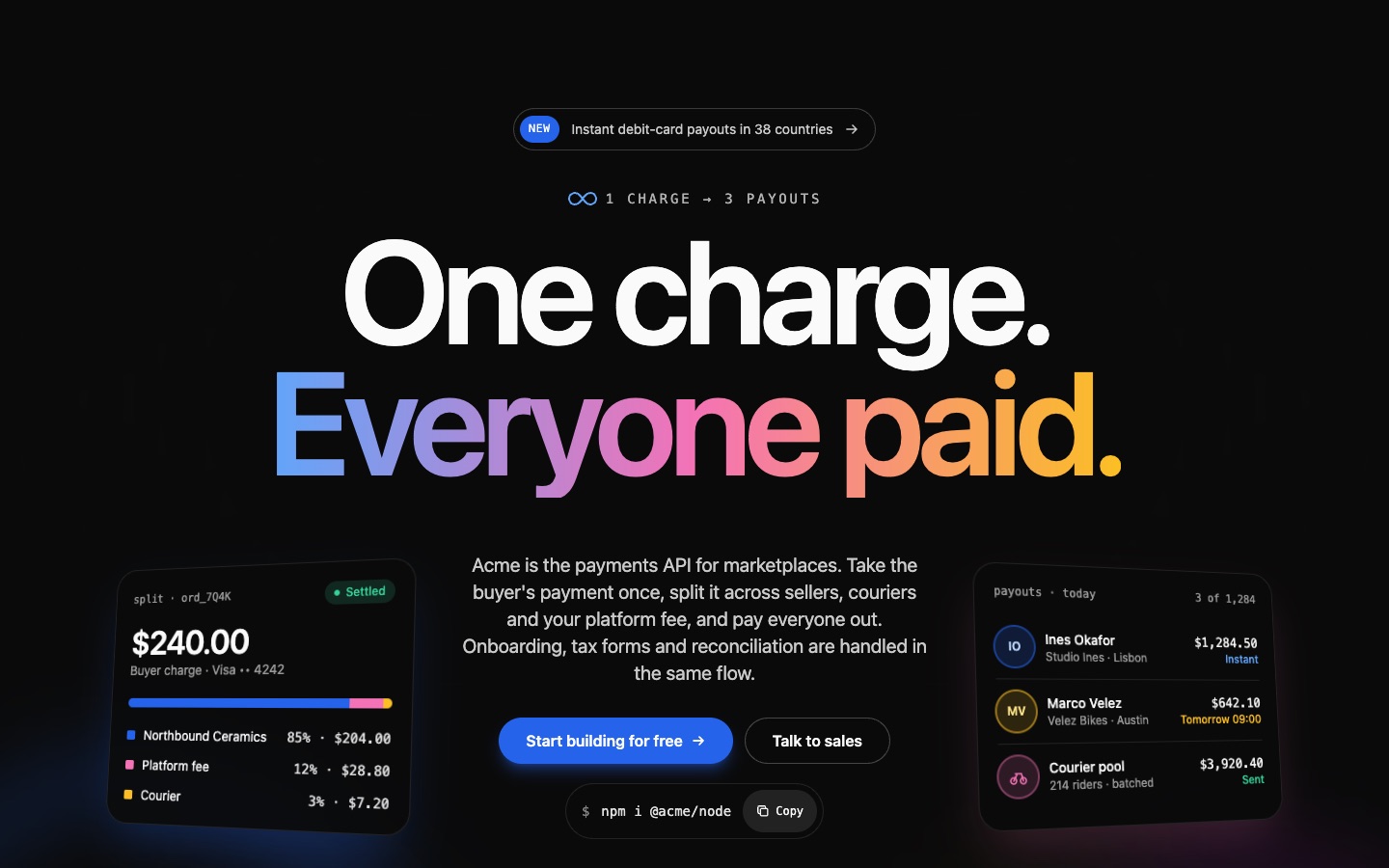
Hero 03: Dark Centered Hero with Oversized Headline and Stat Row
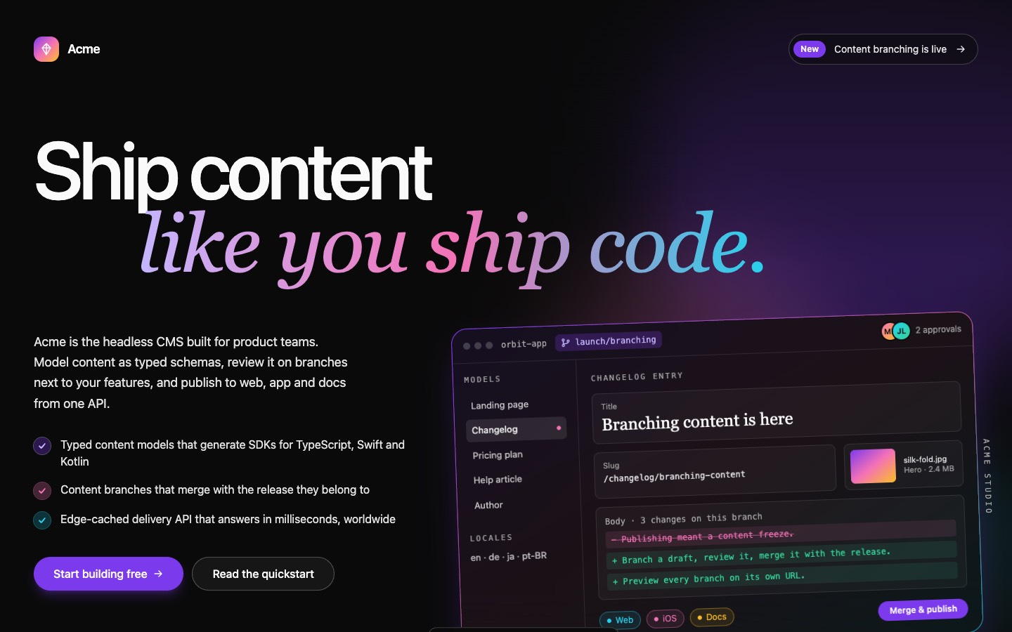
Hero 04: Dark Left-Aligned Hero with Checklist and Editor Mockup
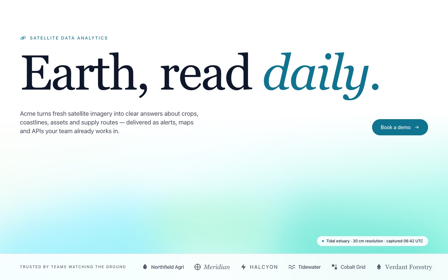
Hero 05: Minimal Editorial Hero with Serif Headline and Logo Row
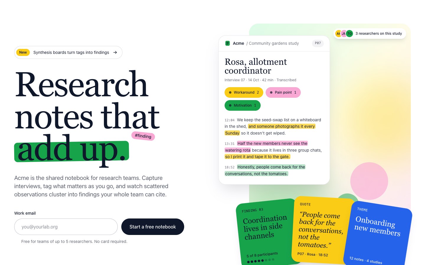
Hero 02: Split Hero with Email Signup and Notes App Mockup
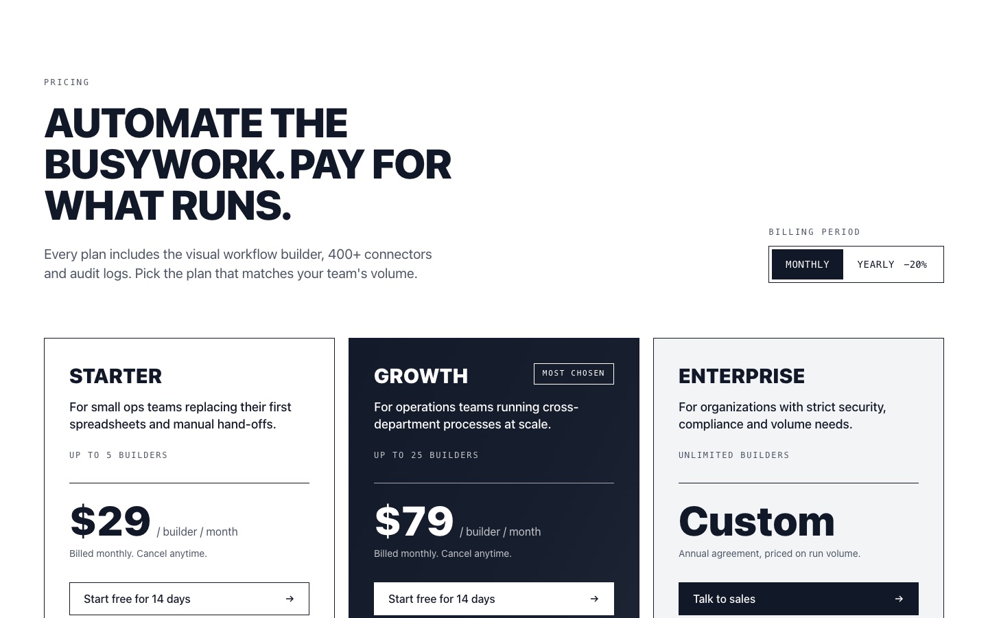
Pricing 01: Three-Plan Pricing with Billing Toggle and Highlighted Middle Card
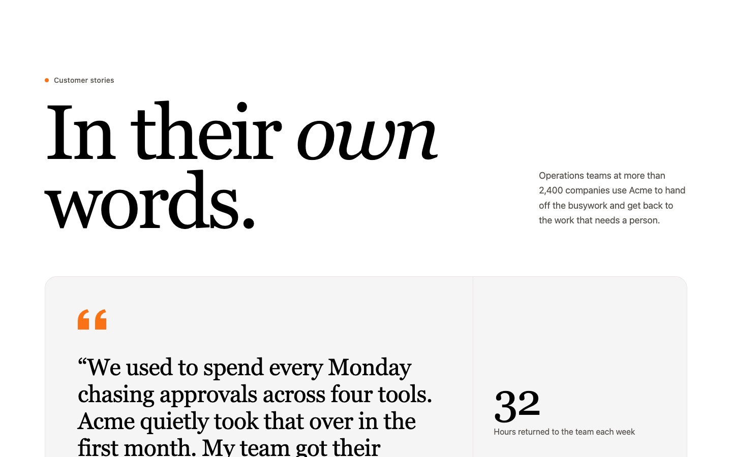
Testimonial 01: Testimonial Quote Cards with Logo Row
Frequently asked questions
Which version of Tailwind CSS do I need?
Sections use Tailwind CSS v3 utility classes and work with Tailwind CSS v3.4 and later. Most classes also work in Tailwind CSS v4.
How do I use a section in Astro?
Copy the HTML and paste it into any .astro page or component in a project with Tailwind set up (@astrojs/tailwind or the Tailwind Vite plugin). No changes needed.
How do I use it in Next.js or React?
Copy the React tab or download the .tsx file, drop it into your components folder and import it. Tailwind CSS must be configured in your project.
Can I preview a section without any setup?
Yes. Download the HTML file and open it in your browser. It loads Tailwind CSS from a CDN for a quick preview.
Does it work with shadcn/ui projects?
Yes. Sections are plain Tailwind markup with no extra dependencies, so they sit alongside your shadcn/ui components.
Can I use the code in client or commercial projects?
Yes, in your own and your clients' projects. You can't resell or redistribute the code as a template or component library.
How many sections can I copy for free?
Every section can be copied and downloaded once you sign in with an Unsection account. Free accounts get 5 copies a week; copying a section you already took this week again doesn't count. Pro: unlimited copies and downloads of every section. Copies reset every Monday 00:00 (your time zone).
See Pro pricing